

2024 RNATx Hybrid Poster Guidelines
*ALL POSTERS ARE REQUIRED TO BE UPLOADED TO THE VIRTUAL PLATFORM.
IF YOU ARE ATTENDING IN PERSON, YOU MUST DO BOTH:
1. UPLOAD THE PDF TO THE VIRTUAL PLATFORM
2. PRINT YOUR POSTER AS 42"X42".
1. UPLOAD YOUR POSTER BY JUNE 1, 2024. Instructions and information can be found below.
2. IF YOU ARE ATTENDING IN PERSON, you must print out your poster (42"x42") AND UPLOAD YOUR POSTER. Instructions and information can be found below.
IN-PERSON POSTERS
Poster Panel Size
Please refer to the below depiction of the poster panels to be used during the conference – please note that there will be two posters displayed on each side of the board. A display area on the panel of 3.5 ft x 3.5 ft (107cm wide x 107cm high) will be allocated for each poster – please ensure that your poster does not exceed this size as you will overlap with your neighbor. It is recommended that you leave a margin of at least 3 in (7.5cm) around the poster. When preparing your poster and considering how much of your display will be visible at eye-level, please bear in mind that panels will be mounted on stands. Please NO fabric posters; they do not adhere well and fall off of the boards. 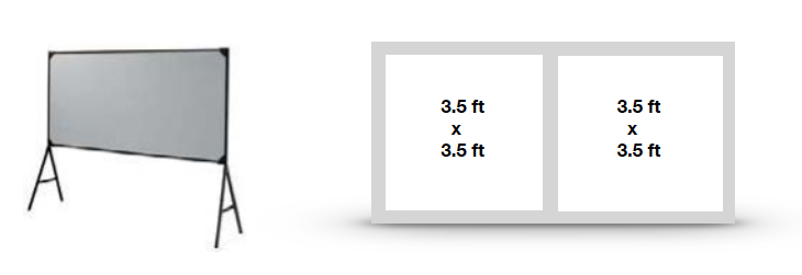
Poster Panel Allocation
A numbered panel will be allocated for each poster and someone will be on hand to help during the poster set up time.
Poster sessions will take place in the Medical School Lobby and Faculty Conference Room in the Medical School Building (across from the ASC building). Posters should remain in place between the setup and removal times shown below. The organizers request that poster presenters stand by their boards for queries and discussion. Poster presenters should refer to the poster program on the information board to check which poster session & board number has been allocated to them.
|
Poster Session |
Presentation Date |
Presentation Time |
Pin Up |
Take Down |
|
Both |
Thursday, June 27 (even) |
Presenters will be notified via email |
Wednesday, |
Friday, |
Note: Any remaining posters in place after the times specified above may be removed by the organizers who accept no responsibility for loss or damage.
Adhering
Posters will be fixed to boards with velcro. Velcro will be available and provided onsite. Some posters will be on corkboard and push pins will be provided.
POSTER PRODUCTION GUIDELINES
A poster should be self-contained and self-explanatory, allowing different viewers to proceed on their own while the author is free to supplement or discuss particular points raised in inquiry. Presentations should be kept simple and clear and a mixture of text and graphics is recommended. Remember that the viewer, not the author, as in the case of slide presentations, determines the time spent at each poster.
Printing Discount Through FedEx
You are eligible to receive a printing discount of your poster and have it delivered to UMass Chan Medical School, to be picked up at the registration booth. It MUST be ordered no later than June 20th. If you select delivery to the symposium, you must call and pay in advance. Delivery is not guaranteed and depends on when you submit your order.
Posters will be printed at the local FedEx location. The cost is $78.62 for 42x42 poster on heavy weight coated stock. This can be processed within 48-72 hours depending on the stores volume when you place the order. Please email the file to usa2597@fedex.com and specify that this poster is for the RNA Symposium. If you need to reach the store you can call 508-756-1977.
Poster Layout
Materials should be printed on poster paper. Arrange materials in columns rather than rows. It is easier for viewers to scan a poster by moving along it rather than by zigzagging back and forth in front of it. An introduction should be placed at the upper left and a conclusion at the lower right.
Illustrations
Figures should be designed to be viewed from a distance and should use clear, visible graphics and large type. Each figure or table should have a heading of one or two lines. Additional essential information should be provided below in a legend. Photographs should have good contrast, sharp focus and, if necessary, an indication of scale.
Text
Minimize narrative. Use large type in short, separated paragraphs. Numbered or bulleted lists are effective ways to convey a serious of points. Do not set entire paragraphs in uppercase or boldface type.
Titles and Fonts
Titles and captions should be short and easy to read. Use large lettering (minimum of 50 point size for headings and 25 point size for text) as this means a number of people can read the poster from a distance without overcrowding. Remember to caption your poster with the abstract title, authors names, and affiliations.
VIRTUAL POSTERS
POSTER UPLOAD DEADLINE: JUNE 1, 2024
Guidance on poster submission fields:
Virtual Event Name or URL: Prefilled – no input necessary.
Poster Title: POSTER NUMBER AND TITLE
Poster Group: Please select the session topic that aligns with your abstract:
- Structure and Function
- Mechanisms of RNA Pathways
- Oligonucleotide Drugs, Modifications, and Delivery
- mRNA Therapeutics
- Editing
- Translating Discoveries into the Clinic
- Initiatives in Education and DEI
Presenter Name: The name of the poster presenter.
Your Email Address: The email address of the poster presenter.
Presenter Affiliation: The affiliation of the poster presenter.
Description: ALL AUTHOR NAMES (including presenter) and ABSTRACT TEXT in this field.
Poster Thumbnail: A representative image of your poster, this can be one of your figures, or perhaps a microscopy image representing your work.
- Thumbnail Dimensions: 240x360; Resolution > 150 DPI
Poster URL: Click the “Browse” button below this field to submit your PDF poster. The file-size should be under 20 MB. Template for download can be found here.
- Poster Dimensions: 42” x 42” .pdf file with resolution of 300 dpi.
Collateral Video URL: Link to a video of your poster presentation (2-minute limit). You are responsible for posting this video online through YouTube or Vimeo and pasting the link. Detailed information on making your 2-minute video, can be found here.
Designing for Accessibility
Poster presentations are highly visual, and people who are blind or have low vision can understand them more easily if you create your poster with accessibility in mind. Some general tips are included below:
- Background and foreground colors should offer good contrast for people with low vision. Red/yellow, red/green, and red/black are particularly difficult to distinguish and should not be used as background/foreground combination. White text on a deep blue background or black text on a white background are better combinations.
- Text over a photo or image background is very difficult to read. If you must use a background image, decrease the brightness, and increase the opacity.

If you have any technical questions or need assistance, please contact RNATherapeutics@umassmed.edu