Dropdown Block
Thursday, March 01, 2018
|
Block: Dropdown Block
Sometimes you don't want a full list of links in your content. Maybe it's too long and takes up precious vertical space, or you want to keep your page simple and not have a long list that distracts from the content. We have a block for that - the DropDown Block.
This block will take your list of links and display them like a dropdown form field. This allows users to click to expand the list and choose an item to navigate to.
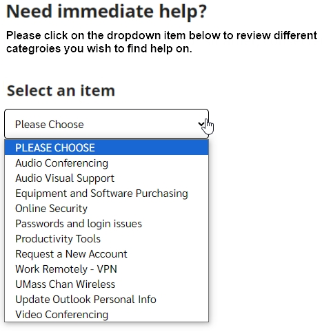
Example page

After selecting an item from the dropdown
the user is shown a description and a clickable button if they wish to navigate to that page
- each item in the dropdown can have a unique description
- the button will always have the same text and color
- the button text can be change, default is "click to view"
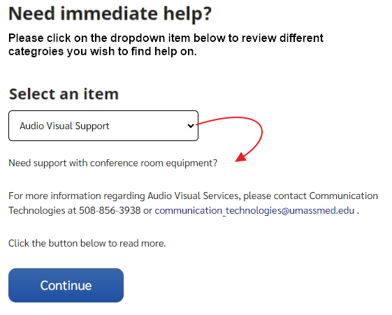
The reason we supply the button is that some viewers may not want to navigate away from the current page. Choosing a dropdown and getting sent to another page is not expected behavior as it does not appear as a link. The best practice is to supply an option to the viewer.
Create the item pages that will appear in the dropdown
First create the dropdown items
- Log into the CMS
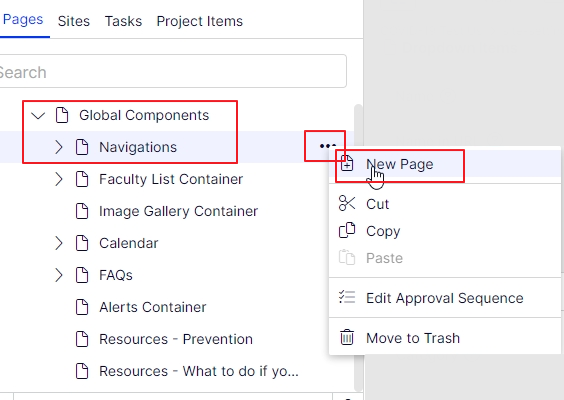
- In your web site, navigate to the Global Components > Navigations container and add a new page
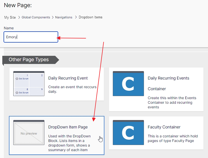
- hover over the Navigation container and click on the "..." and then click New Page
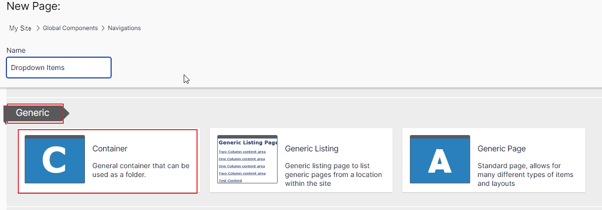
- Type in a name for your container, ex: Dropdown Items or something more unique
- and pick Container
- Create new pages under your new container page
- Give each one a unique name and select Dropdown Item as the page type
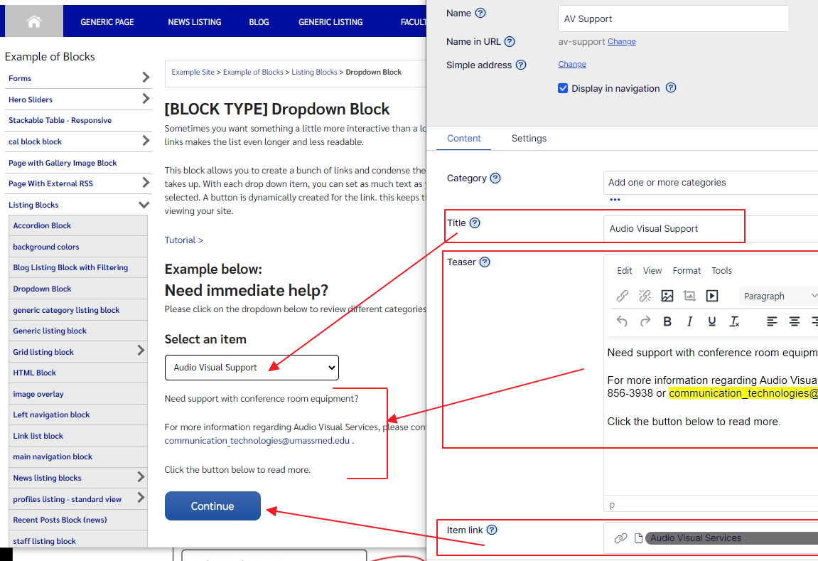
- Dropdown properties
- Title: this is what will show in the dropdown list
- Teaser (optional): will show under the dropdown, after the viewer selects an item, and above the submit button
- Item Link: the link that gets set on the button for this item
- publish each page
Next, create the dropdown block
- In the CMS, navigate to the page you wish to show this block
- In one of the drop block areas (content areas) click on Select Content and choose Create a New block
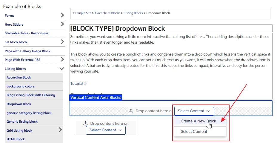
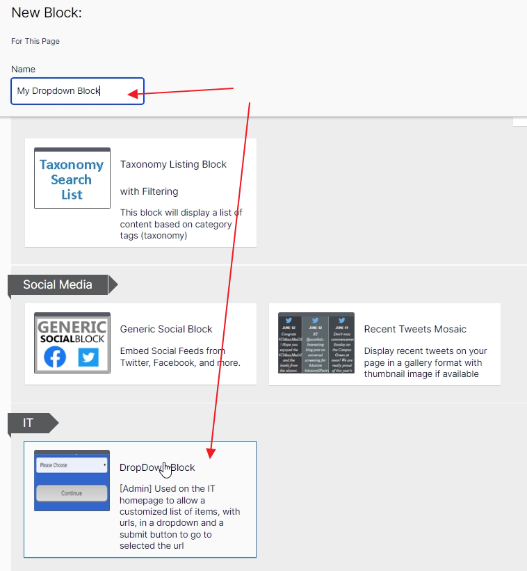
- type in a Name and select the DropDown Block
- You will need to set the required property for DropDown content root, set this to the container you created for your dropdown item pages (under Global Components > Navigations)
- you can click "Select Page" and navigate the content tree until you find your container
- Or drag and drop it from the content tree itself (in the left pane)
- Click the create button
- The block now displays on the page
- Hover over the block and click on the "..." at the right to edit the block
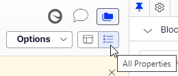
- Click on the All Properties view in the upper left so you can update the properties of the block
- On the Display tab
- you can set the sort order and direction of the items
- On the content tab, you can set optional items:
- Title
- summary/teaser header which displays just above the dropdown
- summary/teaser to show between the dropdown and above the submit button
- the text of the submit button
- how many links you wish to display
- and a category filter if you wish to only show certain items based on their category/taxonomy
- Publish the block
Once the edits with the block are complete, you will need to publish the page on which it resides.

